An Instagram carousel is a single feed post that holds up to 20 photos or videos, which people swipe through from left to right. To make one that gets saved, use a portrait size (4:5, or the taller 3:4) for every slide, put a specific promise on slide one, give each slide one idea, make slide two strong enough to work as a second hook, and end with one clear ask: save, share or comment. The format rewards content people want to keep, so lists, checklists and step-by-step guides do especially well.
Carousels have outlived several "Instagram is all about Reels now" predictions because they give the feed signals that a single photo cannot: swipes, time spent reading and saves. This guide covers the current sizes and limits, how the feed handles carousels, how to make one in the app, post ideas you can adapt, and the writing habits that turn a carousel into something people bookmark.

What is an Instagram carousel, and why does it still work?
A carousel is a feed post with several media items. Small dots under the post show how many slides there are, and people swipe at their own pace. You can mix photos and videos in the same carousel, add a song, tag people and write a single caption for the whole post.
Instagram explains how its feed ranks posts in Instagram Ranking Explained. For Feed, the actions it predicts most closely are whether you will spend a few seconds on a post, comment on it, like it, share it and tap on the profile photo. For Explore, where non-followers discover accounts, the most important predicted actions are likes, saves and shares. A carousel is built to collect exactly these: each swipe adds time spent, and a useful list is something people save or send to a friend.
- Time spent grows with each slide: a reader who goes through eight slides of text stays on your post much longer than on a single image.
- A carousel gets a second chance: Adam Mosseri, head of Instagram, has explained that when someone sees a carousel without swiping, Instagram may show it to them again later, starting on the second slide. Your post has two possible first impressions, so slide two needs to stand on its own.
- Saves and shares come from usefulness: people rarely save a pretty photo, they save a method, a checklist or a list of resources. Carousels are where that kind of content fits best.
What size should an Instagram carousel be?
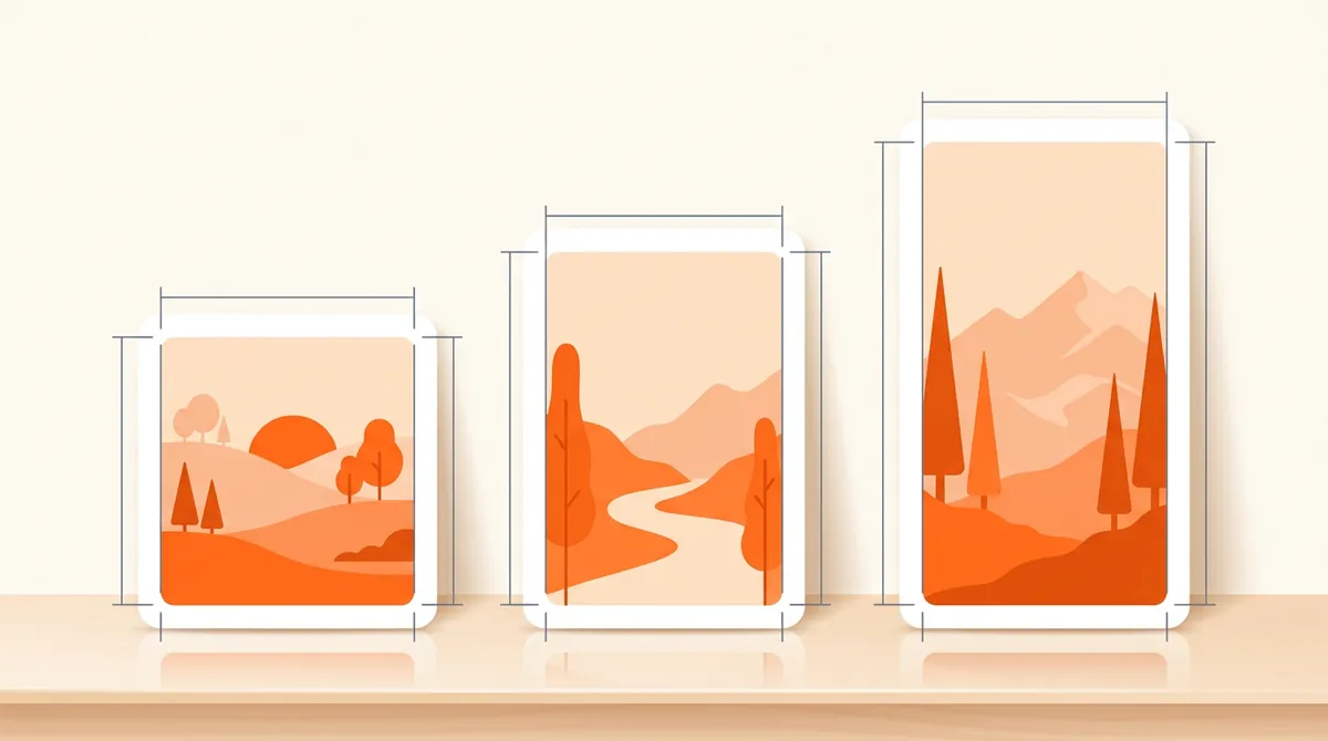
Use the same portrait ratio for every slide: 4:5 at 1080 × 1350 pixels is the safe choice, and 3:4 at 1080 × 1440 pixels gives you a little more height. Square 1:1 (1080 × 1080) still works but takes less room in the feed. Meta's content publishing documentation sets two rules that matter here: a carousel holds up to 20 images, videos or a mix of the two, and all carousel images are cropped based on the first one.
| Ratio | Pixels | When to use it |
|---|---|---|
| 4:5 portrait | 1080 × 1350 | The default for text carousels: tall, readable and widely supported |
| 3:4 portrait | 1080 × 1440 | Phone photos shot in 3:4, posted without cropping; matches the rectangular profile grid |
| 1:1 square | 1080 × 1080 | Product shots or designs already made square; smaller on screen |
| Landscape | 1080 wide, shorter height | Rarely worth it: the slide takes a thin band of the screen |
| 9:16 vertical | 1080 × 1920 | Made for Reels, Stories and TikTok; in a feed carousel it gets cropped, so keep text in the center |
Mixing photos and videos
A carousel can combine photos and videos, which is useful for a before and after with a short clip of the process, or a tutorial where one step is easier to show moving. Videos follow the same crop as the rest of the carousel, so film or export them at the ratio you chose. Keep them short: a long clip in slide three stalls the swipe rhythm.
Since early 2025, profile grid thumbnails are tall rectangles instead of squares. Your first slide is also your thumbnail on the profile, so keep its key element centered, where it survives the grid crop.
Adding music to a carousel
Instagram has let people add a song to photo carousels since 2023, from the music option on the editing screen. It is optional, unlike on TikTok where sound is part of the format. Music suits mood-driven carousels (a trip, a behind-the-scenes day, a photo dump). For text-heavy educational slides it adds little, and many people scroll with the sound off anyway, so do not count on it to carry the post.
How do you make a carousel on Instagram, step by step?
Prepare the slides first (in a design tool, a template or a content tool), saved in order and at one ratio. Then in the app:
- Start a new postTap the + button and choose Post. In the gallery, turn on the option to select multiple items.
- Select up to 20 items, in orderTap your slides in the order you want them to appear. The number on each thumbnail shows its position. Set the crop on the first one, since it applies to the whole carousel.
- Edit, reorder and add musicApply edits to all slides or tap a single slide to adjust it. Long-press and drag to reorder, or drag a slide away to remove it. Add a song if the post calls for one.
- Write the captionOpen with a line that extends the hook, add the context the slides do not have room for, and name the topic in plain words rather than only in emojis or hashtags. End with the same ask as your last slide.
- Tag, add alt text and shareTag people or products, add collaborators if the post is co-authored, and write alt text in the advanced settings so the slides are accessible. Then share, or schedule it for the time your audience is most active.
What are good Instagram carousel post ideas?
The best carousel ideas come from your content pillars: the few topics your account keeps coming back to. If you have not defined yours, our guide to content pillars with examples helps you pick them. Then turn each pillar into the carousel shapes below.
Two more shapes deserve a spot in your rotation: myth versus reality (each slide breaks a common belief in your niche) and before and after (slide one teases the result, the next slides show how you got there). Rotate shapes inside the same pillar, so you learn whether your audience reacts to the topic or to the format.
- Checklist
- Tutorial
- Mistakes
- Resources
- Case study
- Myth vs reality
- Before / after
- Photo dump
How do you make carousels that get saved and shared?
Write for the save
- Promise something specific on slide one: "9 things to check before launch" tells people what they get. "Launch tips" does not. Big type, few words, one visual.
- One idea per slide: a short title and, if needed, one or two lines under it. If a slide needs a paragraph, split it.
- Make it complete: a carousel people save is one they can use without your caption. Give the actual steps, numbers or names, not "it depends".
- Keep the best for near the end: your strongest point on the second to last slide rewards those who swiped and gives them a reason to save.
- Ask for one thing: a checklist calls for "Save this for your next launch", a resource list for "Send this to someone who needs it", an opinion for a comment. Pick one.
Design for a small screen
- Readable at arm's length: large type, strong contrast, and a darkened or blurred photo behind any text.
- Same layout on every slide: title in the same place, same fonts, same colors. Your followers start recognizing your posts before they read the name.
- Real photos when you have them: your product, your team, your results. They beat generic stock images because they prove you did the thing.
- A visual cue to swipe: an element that runs off the right edge of slide one, or a small arrow, tells people there is more.
If you already post slideshows on TikTok, you can reuse most of the work: same hook, same slides, exported in 4:5 instead of 9:16, with a caption rewritten for Instagram. Our guide to TikTok carousels covers the TikTok side, from photo mode specs to music.
The hard part for most accounts is not the format, it is producing a good carousel several times a week. That is the part Bloomr handles. Its AI carousel generator writes carousels from your brand's content angles with a hook on slide one and one idea per slide, using real photos (from your media library or Unsplash) or generated images. Slides come out in 9:16, 4:5 or 1:1, with text styles set for each brand and tracks from the music catalog, and carousels are published directly to Instagram and TikTok. You review the drafts, keep the ones that sound like you and skip the rest.